The AFC wins the Lamar Hunt Trophy and the NFC wins the George Salas Trophy.
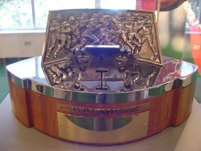
For all the previous years the trophies used to look like this:
 Oak with a tough forged metal look. Pretty dominate and recognizable.
Now the redesign of the Lamar Hunt Trophy and the George Halas Trophy will look like this:

The NFL says it wanted to change the look of the AFC and NFC Championship game trophies to coincide with the look of the Lombardi Trophy.
The new championship game trophy took nine months to design. Tiffany and Company makes it, which is the same company that makes the Lombardi Trophy.
I think the new trophies are very futuristic looking and they do resemble the Lombardi Trophy.
What are you're thoughts on the AFC and NFC Championship trophy redesigns?

uggggggggggggggllllllllyyyyyyyyyyyyyyyyyyyyy
ReplyDeleteugggllllyyyy +1
ReplyDeleteWhy mess with tradition? Although it will make it easier for hardcore fans to craft a replica of one from tinfoil to carry into the stadium during future championship games.
ReplyDeleteLooks cheap and weak
ReplyDeleteThey suck bring back the old one's
ReplyDeleteToo small & cheap looking!! Bring back the old trophies!!
ReplyDeleteLove the new design
ReplyDeleteThey're awful.
ReplyDeletehttp://pravata.wordpress.com/2011/01/25/nice-trophy/
just the nfl making another mistake,plan and simple!!!!!!!!!!!!!!!!!!!!!!
ReplyDeleteI agree with the above comment; under the new commissioner is being run more and more like a business and less like a prideful family tradition. I can understand wanting to change the old trophies; they look like a block of wood and are hard to capture well in photos for newspapers. However, they look solid and will last ages. The new ones are so SMALL and WEAK. They should have gone with a 10% small Super Bowl trophy in bronze. Frankly, it looks like something a knock-out league would come up with to feed off the NFL's success.
ReplyDeletelooks good to me and the new one is about as big as a nfl players helmet bigger then the old one people are dumb and just want to bitch about anything and everything
ReplyDeletethe design is ok, but they're way too small. They look like toys instead of something denoting a conference champion and a Super Bowl team. The old trophies made you feel like you won something significant.
ReplyDeleteAfter seeing the new trophies presented today to the Giants and Pats, I have to see the new trophies look small and weak compared to the old trophies. The old trophies had more heft and significance to their design. The new one is stylish but kind of puny looking. They should have stuck with the old trophies.
ReplyDeleteBottom line is: Do you want a Championship Title Belt or a People's Choice Award?
ReplyDeleteOksana Baiul
ReplyDeletethe new trophy is a sleek and nice design. but I'm a fan of tradition. hockey have lord stanley's cup. the masters have the green jacket. yachting has the americas cup. the nfc and afc need the george stanley halas trophy and the lamar hunt trophy.
ReplyDeleteplease do not mess with tradition also keep the lombardi trophy.
I think they should keep the old design & size & update it with the new sleek material.......just bring the look up 2 date "IJS"
ReplyDeleteTHE NEW TROPHYS ARE AWSOME!!!
ReplyDeleteTried to give it a bit to sink in, but the new one looks super cheap and suck. I understand the need to make it the same scale as the super bowl trophy, but the cut out makes it look dinky. And what the F'n hell is a foo foo jewelry company designing a football trophy?. And why the need to make it look similar to the super bowl trophy? Different is good and the old one gives the winner their own identity.
ReplyDeleteThank you all for the consensus. I made the trophies for thirty years and was dissapointed when they
ReplyDeletedecided to make a change and have the trophies made in China.
Its sad that even the warrior culture of professional football has to be sissified with a "foo foo" award.
They look like cheaper BCS trophy... why change it... why.. the trophys they faught for was the halas and hunt trophy.... and its only lombardi because he won.... UGLY UGLY UGLY... TIFFANY U FAILED NFL U FAILED.... DISGUSTED
ReplyDeleteI think back when you where a kid making toys models cars and you got that plastic chrome that's what it's looks like.
ReplyDeletethe new trophys look awful , the old ones have traditions that go way back
ReplyDeleteI think the NFL got it right as the new trophies are designed as hollow and as empty as the victory they represent. No team wants just that trophy. The only one that matters is the Lombardi Trophy. So who cares what it really looks like.
ReplyDeleteIt all depends on the type of game or activity you are purchasing the trophies for. Trophies should represent the look and feel of the event they excelled in.
ReplyDeletePosted by | Cheap Trophies
NINE MONTHS????,if I came up with something that common and lame after nine months I would fire myself.they are at least better than those F1 indy car trophies,now those are are really bad.but yeah I like the old one better,this looks like someone spray painted a football silver and put it on a chunck of wood.exaggeration I know but you get my drift.no pun intended.
ReplyDeleteAgree they are way too small might be cool if they were bigger and heavier I mean it is Tiffany. But it looks like a pee wee football trophy. WTF? Put that on top of the old bigger wood and make it bigger!
ReplyDelete